NeuroAct
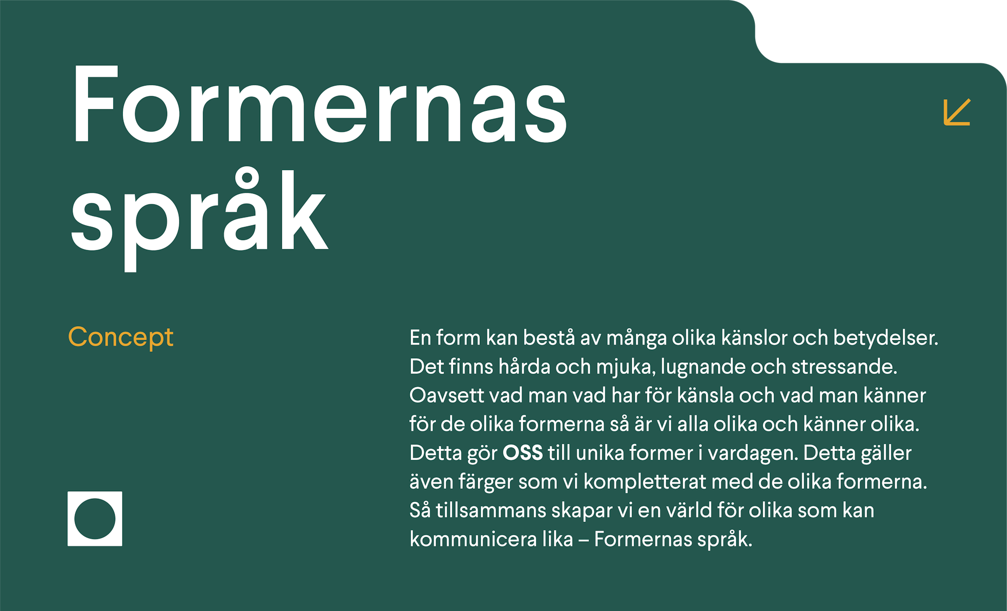
NeuroAct is a brand that specializes in creating educational materials for the field of neuropsychiatry. Their materials are designed to help individuals better understand the complex interplay between neurological and psychiatric conditions, and how they can be effectively treated. With a focus on clarity, simplicity, and innovation, NeuroAct's materials are accessible to a wide range of learners, from students to professionals.
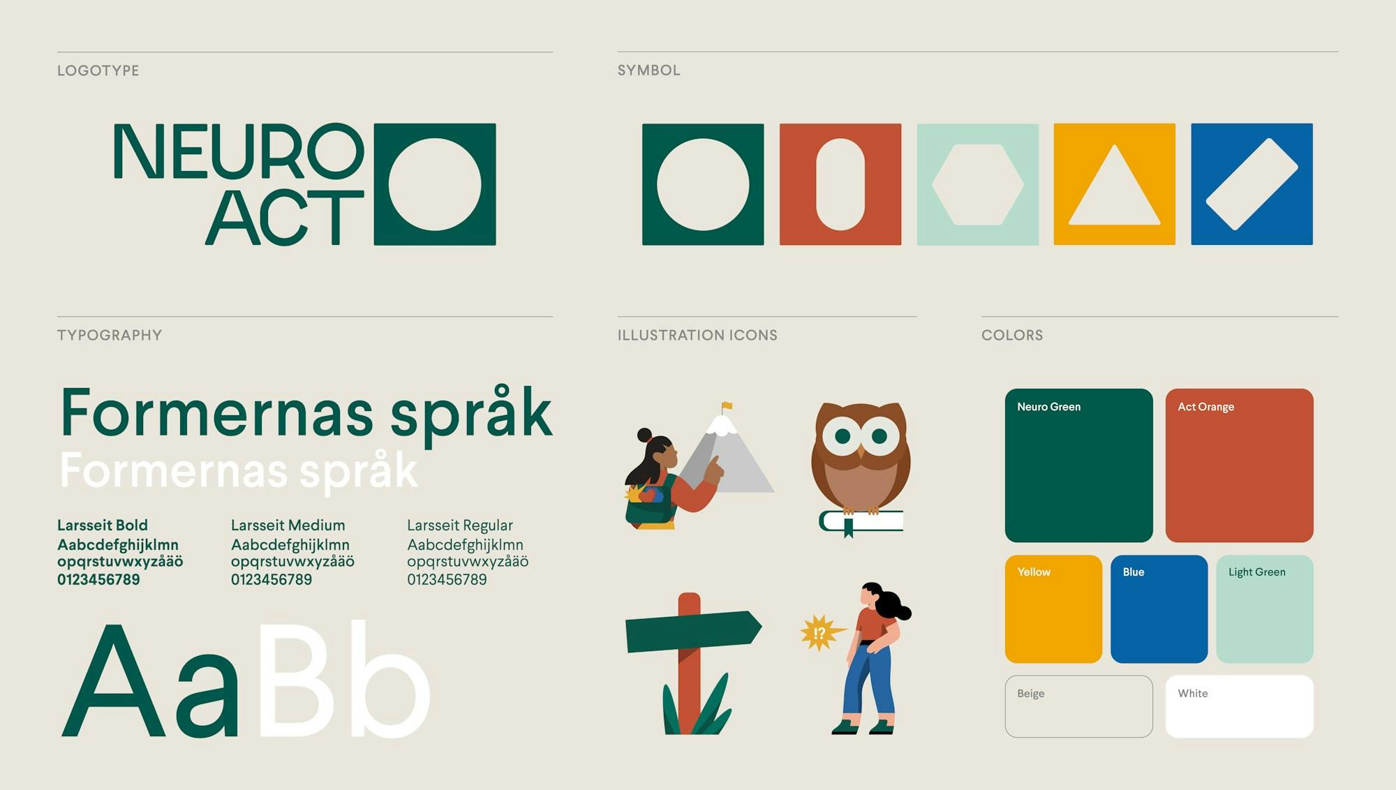
NeuroAct's brand identity is distinctive, featuring a color palette of green, orange, and complementary colors. The green color symbolizes growth, harmony, and balance, while orange represents energy, enthusiasm, and creativity. The complementary colors add visual interest and contrast to the brand's visual identity. The NeuroAct logo features a stylized brain with a circuitry design, which highlights the brand's expertise in the field of neuropsychiatry.


Eager to get the ball rolling? If you'd like to meet up, brainstorm ideas, or find out more about us, feel free to get in touch.